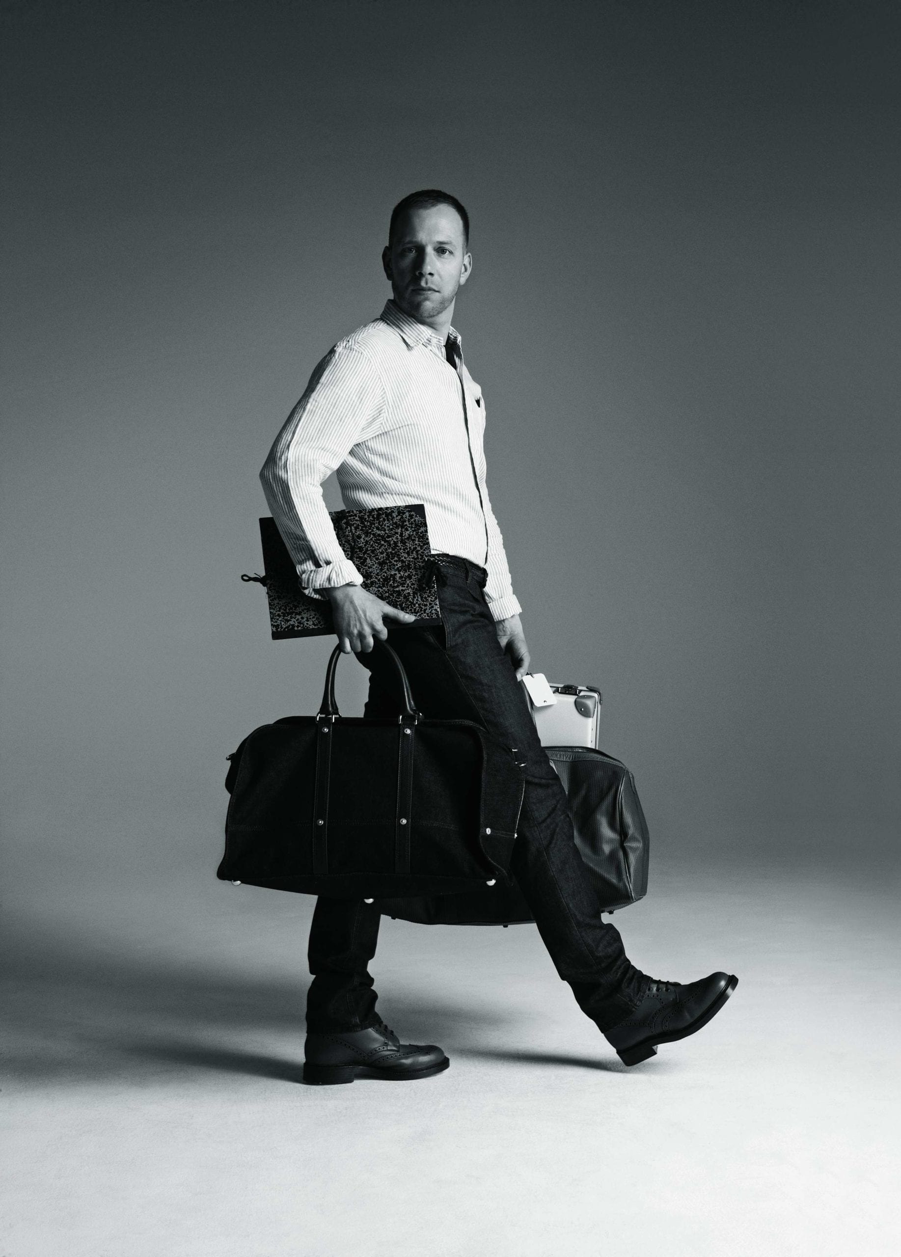
“By now,” writes Gert Jonkers in parentheses, “Thom Browne and I have worked our way through a bottle of champagne at the exclusive Soho House, and we’ve cabbed to Il Cantinori, a swanky restaurant in the East Village, where we’re at a table in less than no time – even though the place is packed.”
“Wow. I feel like we’re on a date,” says Browne, who had agreed to be interviewed for the first time for a new menswear magazine launched in 2005, titled Fantastic Man.
As reported by Jonkers, the co-founder of the magazine, they had just discussed Tommy Hilfiger and Calvin Klein, the importance of a snugly tailored suit, of how one should wear trousers. Their exchanges were, in some respects, the kind of thing you might read in any fashion magazine.
Yet this moment, an editor and revered designer slightly tipsy in the close confines of a restaurant, captures the singular achievement of Fantastic Man – a revealing, casual and glamorous confidence that allowed an independent magazine published by two unknown designers from rural Holland to become the defining menswear title of its era.
“Fantastic Man created a new understanding of glamour through its off-centre, off-beat way of portraying men,” writes Dutch fashion photographer Inez van Lamsweerde in a foreword. “It has a sense of freedom that feels joyful, and it has no fear of ambiguity. On its pages, men can look slightly feminine, or you might just see the back of a head. For a photographer, this allows certain sensitivities – it creates the possibility for all sorts of undertones.”
It’s approaching rush hour on a grey, humid day in central London, and Jop van Bennekom, the magazine’s co-founder along with Jonkers, have agreed to meet me in Holborn Dining Rooms, all low-lighting and tinkling ice and compliant waiters in waistcoats. Van Bennekom strolls in wearing shorts and a short-sleeve shirt. He’s in the midst of press week, is unshaven, a little unpolished, looking more like a Dad at the seaside than a denizen of the ultra-premium fashion industry. It’s a look van Bennekom cultivates with ease – elusive, understated, the opposite of a show-off.
“It was super-hard,” he says of his early days as a publisher, after ordering a beer and a plate of cured meat. “You tend to forget about the hard times and celebrate the good ones, but I wouldn’t recommend it, especially not now. A lot of new magazines exist for four or five issues and then they’re gone. It’s so difficult to create a sustainable business model out of magazines. You either need to sell lots of copies, or have lots of advertising. That means editorial success and commercial success hardly exist [together]. You could afford to be a lot more naive about things 20 years ago.”
Jonkers is the son of a preacher from the Dutch countryside; van Bennekom the son of a teacher from the middle-class suburbs. Each defined their style and launched their careers from uneventful, socially conservative backgrounds. “I had three television channels when I grew up,” van Bennekom says.
The pair met in Amsterdam in 1997, when Jonkers, then an art critic for the Dutch newspaper De Volkskrant, interviewed van Bennekom, a graphic design graduate who founded Re-Magazine, the influential title he began as a conceptual graduation project on leaving the Jan van Eyck Academie in Maastricht, which he managed to sustain for 12 issues until 2005. Each was predicated on a different thematic idea – how to understand boredom, for example, or, as in the case of the last issue, an exploration of an individual, with No 12 focused on a London-based woman struggling with depression, featuring portraits of her and the excerpts of an eight-hour interview.
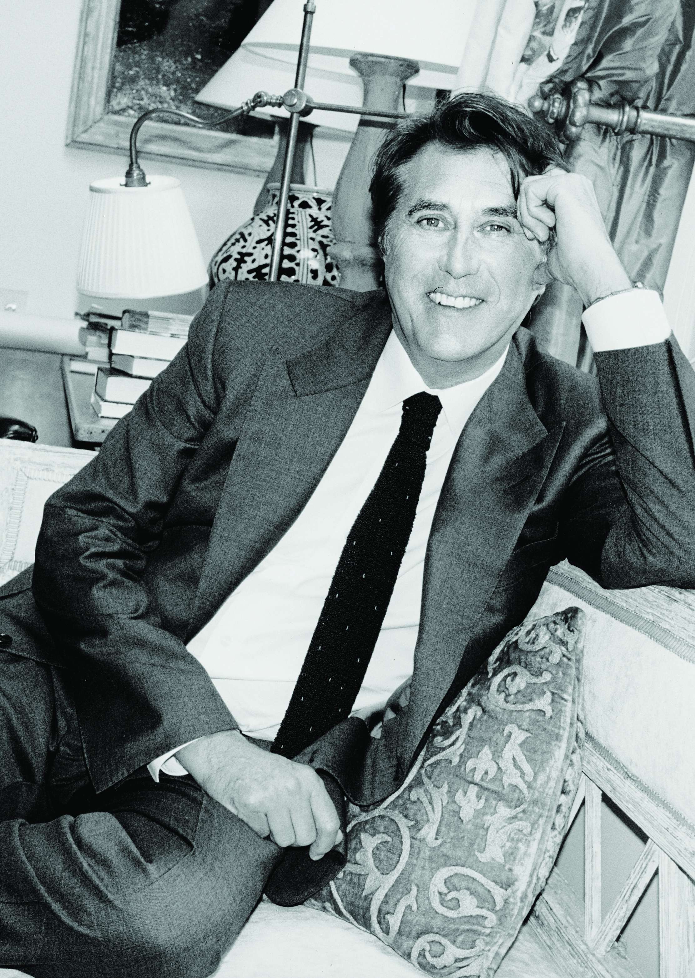
It’s a high-minded ambition, and van Bennekom was getting a lot of press for his work on it. Yet he is also happy to recall the “intense struggle” of founding the magazine, going from shop to shop, trying to attract local distributors and advertisers, and getting nowhere. “I was attracted to Re because it was so realistic and direct, but it was also completely strange,” Jonkers says of discovering the magazine. “It was about mundane subjects, yet it was outlandish. Somehow it didn’t feel at all contrived.”
Realising they socialised in overlapping groups in Amsterdam, the two started to hang out socially, before Jonkers hired van Bennekom as a graphic designer for a generic lifestyle magazine he worked on called Blvd. “I couldn’t stand it,” van Bennekom says. “I couldn’t stand having a boss. I couldn’t stand the hierarchy. I wanted to develop something and have a dialogue editorially.”
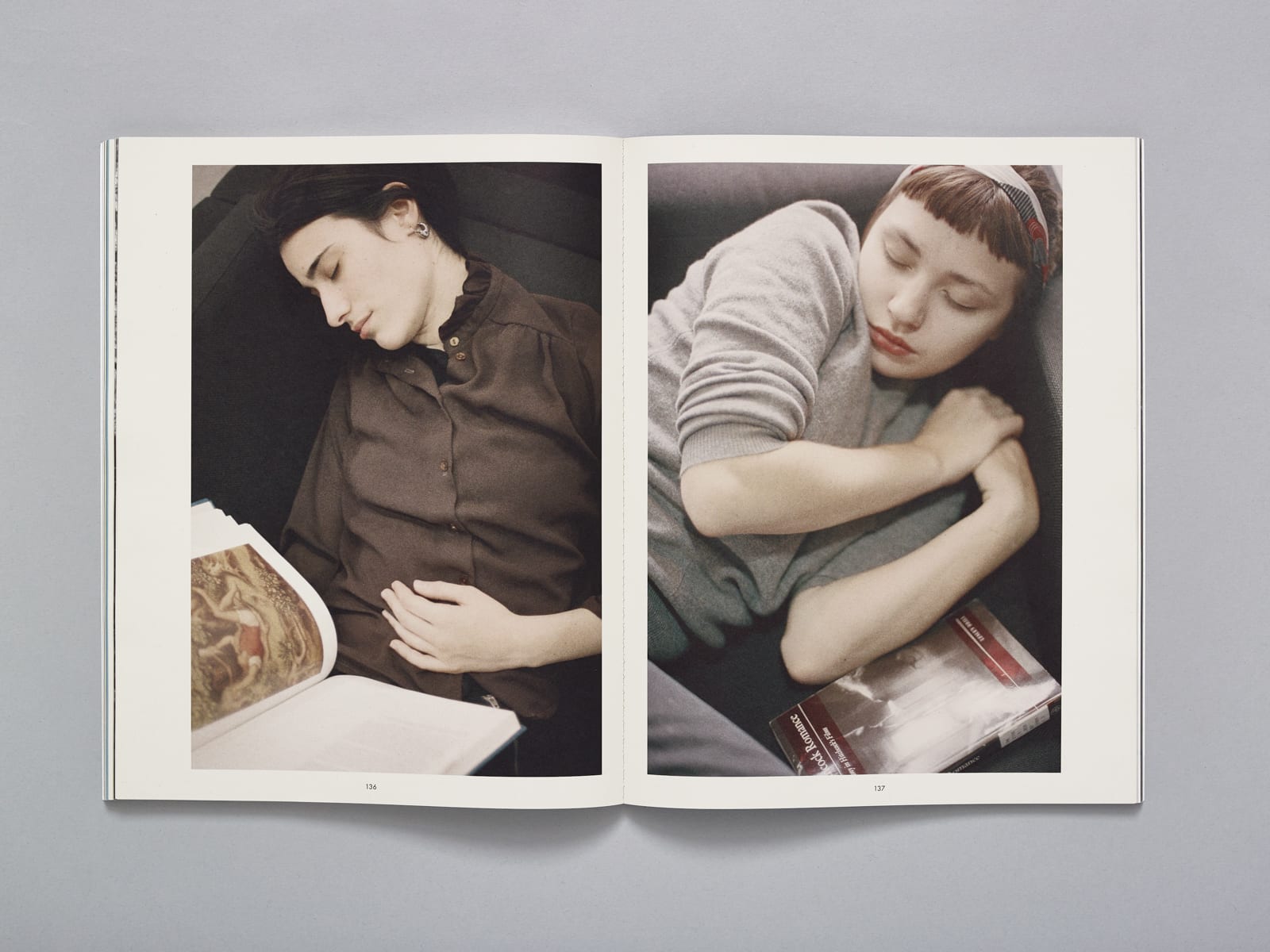
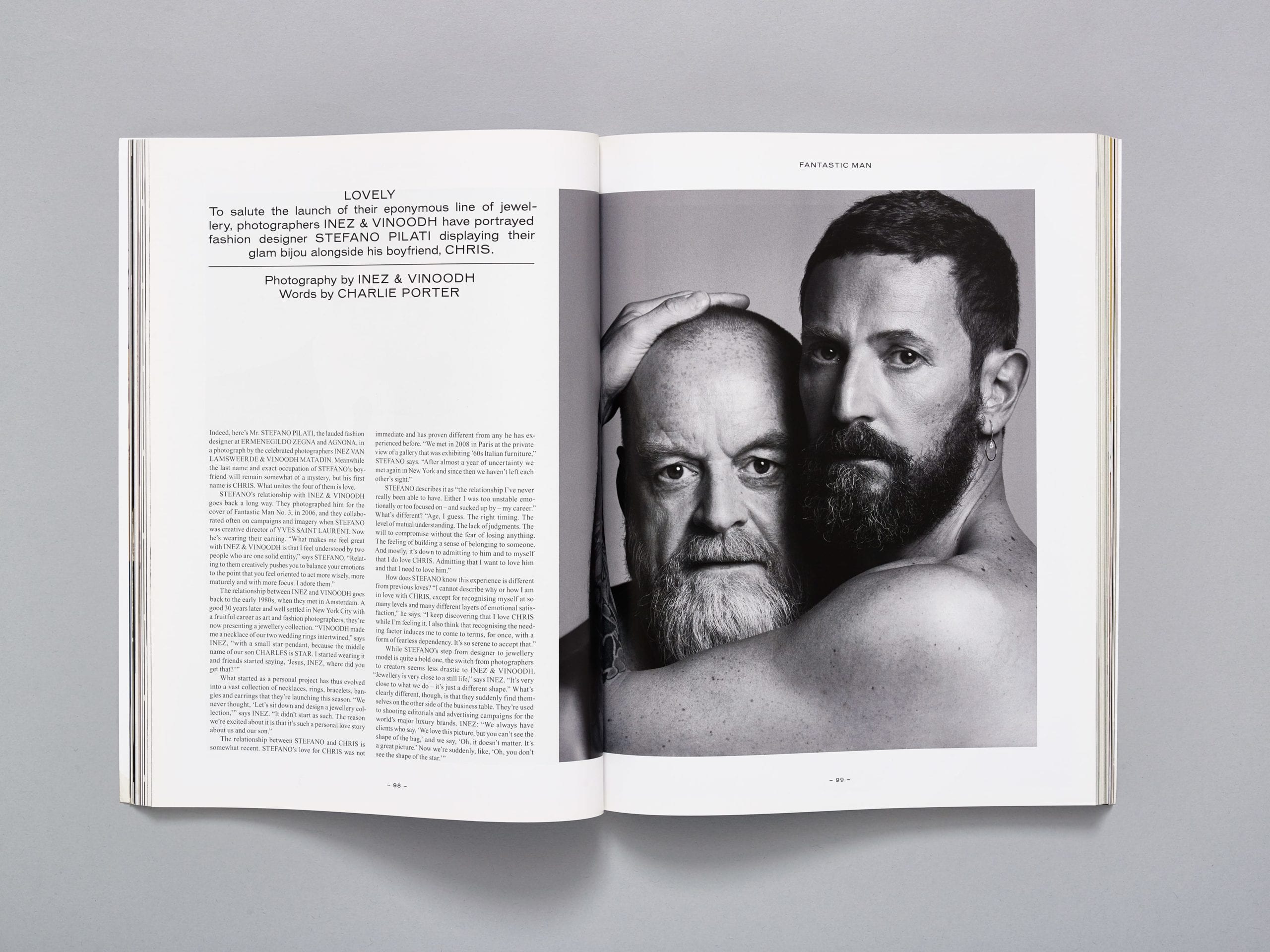
Jonkers and van Bennekom are both gay and, out of hours, spent a lot of time together on the gay scene in Amsterdam. But in their working life, in the journalism they produced, their sexuality wasn’t reflected back to them. “We weren’t making gay media and there wasn’t any gay media we liked, so there was a weird disconnect between our professional and private lives,” van Bennekom says.
In 2001, the pair launched their first major collaboration, a magazine catering for gay men which they subtly called Butt. Printed on pink paper and set in American Typewriter font, Butt was composed entirely of frank interviews and erotic portraits. “We wanted to launch a very clean model in which a gay man could identify himself,” van Bennekom says. “People felt attracted to it on a very personal level. It became a very big world in just four years.”
It quickly became something of a cult phenomena in the gay world; witness Club Butt, a Facebook-like digital community for gay men that remain devoted to the magazine, independent of Jonkers and van Bennekom. Yet despite its influence (which reached well beyond its intended audience, winning fans among the doyennes of publishing and design), the pair had bigger plans, laying the foundations for a mainstream, universal fashion magazine. “We really enjoyed making Butt – there was a realism to it that we liked – but both Jop and I felt it would be interesting to make a magazine that was about men getting dressed, rather than getting undressed,” says Jonkers.
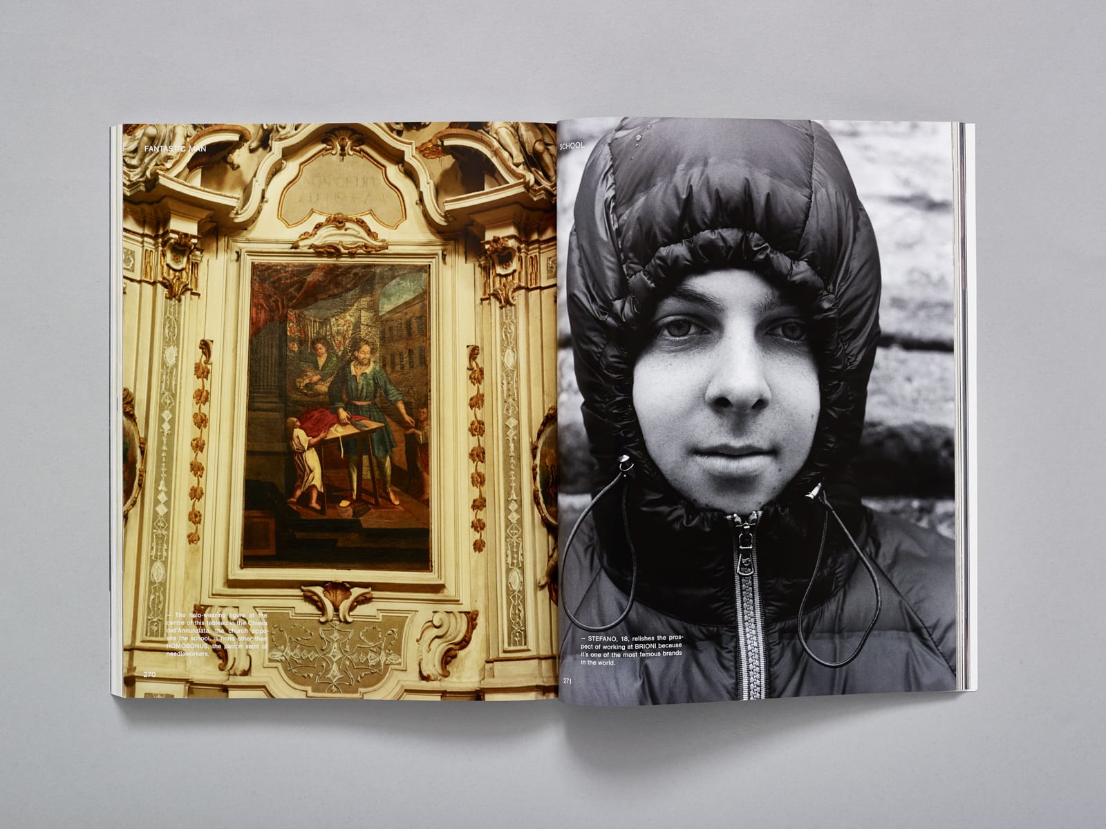
Their entrance into the fashion world – a notoriously elitist, sewn-up industry – is remembered with a sense of insurgency, but plenty of self-depreciation. “We bluffed our way into the fashion system,” van Bennekom says. “We were quite naïve. I was clumsy and worked things out by experience. But, at the same time, we didn’t understand why fashion and lifestyle magazines were so predictable.”
For van Bennekom, his sexuality is indivisible to style, his experiences as a gay man integral to his work as a publisher. “When you grow up gay, you have to hide something,” he says. “In my experience, you had to express yourself with a certain type of sock, a certain type of tie. And so, a lot of fashion is based on those certain tones you can only see from the corner of your eye. You learn to check out whether someone’s gay or not, and so much of men’s fashion, so much of men’s style, is defined by just that.”
Fantastic Man went on shelves for the first time in Spring/Summer 2005 with a print run of 20,000 and Rupert Everett grinning out from the cover. Inside, they ran an 11-page spread featuring images of the actor by the British/Norwegian fashion photographer Benjamin Alexander Huseby. Along with the Thom Browne interview, they managed to bag access to Malcolm McLaren, former manager of The Sex Pistols, the ballet dancer Ander Zabala, and Dennis Freedman, creative director of W magazine, “who hoards amazing art and design in his Hamptons hideaway”.
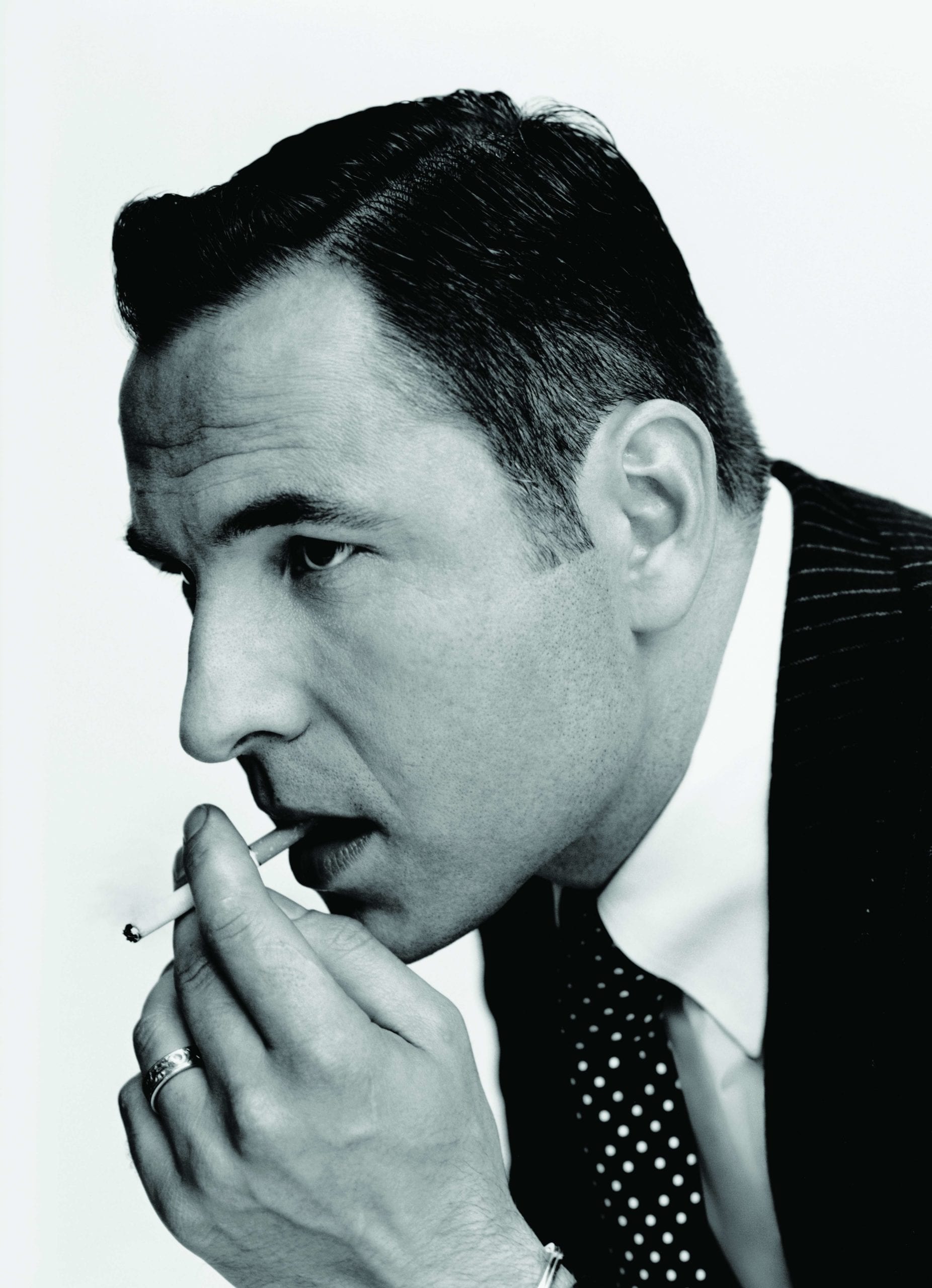
Their age, their perspective and experience combined to create a more mature, understated image of male style, not defined by some avant-garde interpretation straight from the fashion houses. “We really believed the fashion industry had the wrong idea about menswear, especially back then, because grown-up menswear isn’t the kind of thing that changes every six months,” Jonkers explains.
“Men who spend money on clothes gravitate towards a certain personal style. I think that one of the best things you can achieve as a man is finding your own style and being comfortable in it.”
The issue was large and spacious, with an austere two-column layout and set with Engravers Gothic typography. But for the elegant black-and-white portraiture, Fantastic Man could have been a legal periodical, or a memo from the House of Lords.
The interviews featured people who did not necessarily have something to promote, but were merely of interest to Fantastic Man. They looked fantastic in clothes you see most men wear; highly attuned basics, jumpers and shirts and polos. There were no plugs, no shout-outs, no agreed parameters. Instead of trying to sell a product, Fantastic Man gave an insight into the private lives of its subjects – they would converse about grooming, the meaning of style, personal taste.
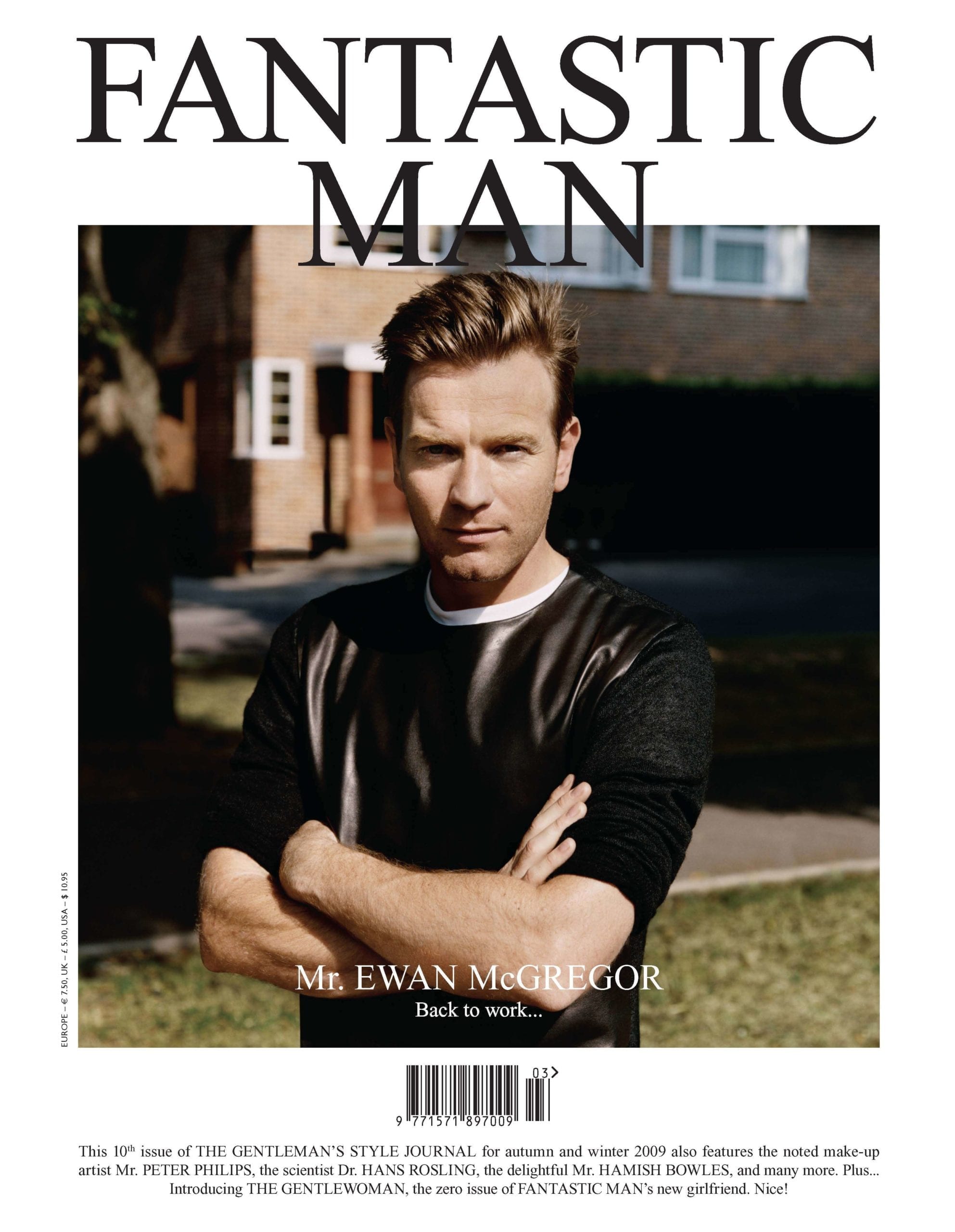
Cover features have included the German-Austrian actor Christoph Waltz, the retired tennis star Boris Becker, and American novelist Bret Easton Ellis. Fashion photographers shooting for the magazine include Wolfgang Tillmans, Alasdair McLellan, Bruce Weber.
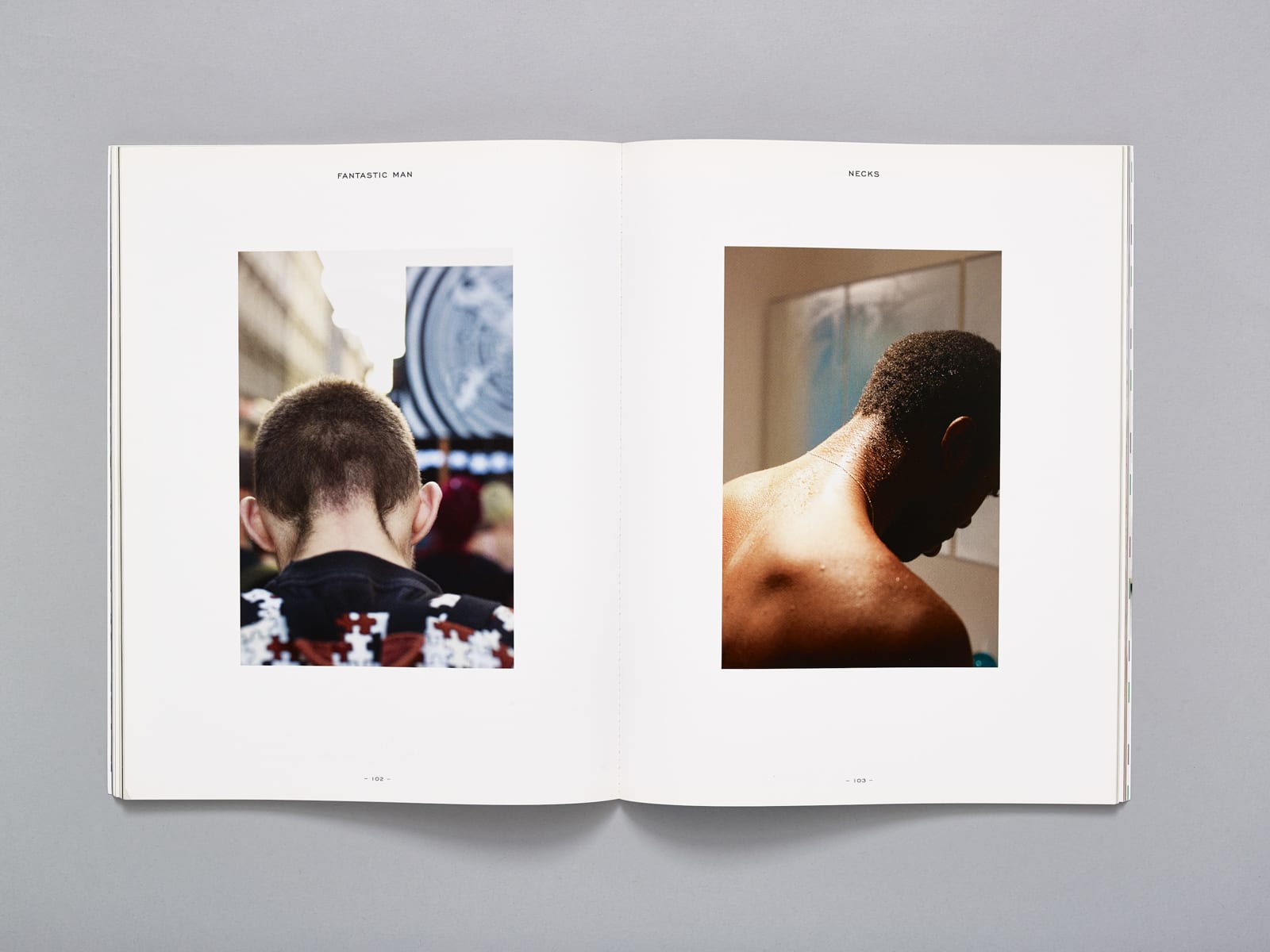
“In good photography, there’s a lot going into the image,” Jop says. He succeeds in commissioning the sort of detailed, daring fashion photography that isn’t seen elsewhere; austere, monochrome images of men in full-body underwear, the kind of thing Steptoe might wear if he won the lottery. An extreme focus on the stitching of a crew neck jumper, over a double-page spread. Men in head-to-toe beige, barefoot and paddling in the shallows of a nudist beach. The intimate focus of Wolfgang Tillmans’ neckline, the way his hair carefully tapered and faded, the cut of his shirt on his shoulders.
Ten Years of Fantastic Man – the groundbreaking men's style magazine
Pages: 1 2

