It’s a spectacularly beautiful early morning in December and the traffic is rolling past indifferently on one of North London’s less than silent streets. I’m standing in front of a large red door, having come to visit David King and his world-famous collection documenting the extraordinary visual history of the Soviet Union. King has been assembling the collection for almost five decades and now it is in the process of being transferred to the archives of Tate Modern.
The collection has always run in parallel to his work as a graphic designer, photographer and author – work, it is fair to say, that shows influence from the Bolshevik-era material he has discovered on his many visits to the former USSR, and which he has often drawn from in his books, posters, photographs and graphic work.
He leads me up to the fourth-floor loft space, and as the electric blinds in the roof roll back, all is revealed. Working layouts and original artworks cover the floor. “Here is the plan for my next book, a work dedicated to the world of print and revolution,” he announces.
“This will be page 1, an original vignetted sepia print of the last photograph ever taken of Karl Marx from late February 1882. Marx was on holiday in Algiers and he visited the studio of a French cabinet photographer, E.Dutertre. I found it by chance many years ago whilst visiting a long-forgotten secondhand socialist bookshop in Stanmore.”
Brandishing bandaged fingers, King laughs about his hands-on approach. Our interview had been delayed by a week after he badly slashed himself with a scalpel knife (“by mistake, blood everywhere”). “Of course, in the later stages of production I use the computer, but I work out the design of my books in the old manner, with grid sheets and photographic prints. For me it’s the only way. Seeing the layouts on the floor, I can think much longer about the sequences of everything, 30 or 40 pages at a time; close ups, long shots, point pictures, multiple images, etc.”
Every step of the journey back to the kitchen reveals something new. “This is the Trotsky archive, hundreds of photographs documenting the great revolutionary from nine years old to assassination”; or, “All the heavyweight Soviet photo albums of the 1920s and ’30s are kept in there”; or, “Here lies the visual history of Weimar Germany before Hitler, but it’s all cased up for Tate Modern. Half of it is already gone, I’m just waiting for them to take the rest.”
It’s a life’s work, and appropriately King’s interest in collecting started when he was very young – perhaps even before he was born – because he remembers seeing a mysterious object in his grandmother’s house. It was a lead cosh that had belonged to his great grandfather, an engineer for the Great Western Railway when the company was contracted to build the Russian rail network under the tsars. “I was told it was used to beat off wolves in the forests when they were laying the track. I hope that was all it was used for.”
“I was a disaffected teenager. I painted abstraction, and when I was 16 or 17 somebody said I should go to art school. My dad, who was very supportive, went along with me for the interview. They looked at my work, said something like I had a very good colour sense and could start in September. It was all so simple.”
King attended the London School of Printing and Graphic Arts (LSP) between 1960 and 1963, an institution known these days as the London College of Communication, part of the University of the Arts, London. “I didn’t really know what I was doing,” King laughs. “On arrival I found myself sitting in the middle of an induction group being addressed by one of the lecturers who announced, ‘So you’ve all decided to become typographers’. I was thrown into panic. I thought I’d made a mistake and gone into the wrong room. I didn’t even know what a typographer was. I guess I still don’t.”
But the course turned out to be “absolutely amazing”, says King. “We were studying with up to 12 different working designers per week, as well as taking night schools in photography.” He particularly valued his time with Rolf Brandt who taught Basic Design and Robin Fior, a distinguished left-wing typographer.
“Rolf taught us to see in both abstract and surrealist ways. Having arrived in London in the early 1930s, he had been taught at a private art school in Shaftesbury Avenue run by the French Cubist, Amédée Ozenfant. To pay the fees, Rolf acted in walk-on parts at Wyndham’s Theatre down the road. You see, he had a strong German accent so he used to be given lots of five-minute roles as a bad guy in a black hat who drew out a revolver when somebody needed to be shot in the final scene. That’s what got him through art school.
“Rolf was a remarkable artist and when we met up again years later we became close friends. Rolf ’s brother was the distinguished photographer Bill Brandt, and Rolf loved ‘Beelly’, who used to protest to him that he (Billy) did not at all have a strong German accent. This always made Rolf roar with laughter.
“Bauhaus design was never really political enough for me,” continues King, “and I never wanted to spend my life doing zigzagged letterheads. I didn’t mind the zigzags but they had to be content-orientated”. So another lecturer, Keith Cunningham, suggested to King that he move in the direction of photojournalism and magazine design. Within a year King found himself working for a short time at The Observer where he met and became lifelong friends with “the gigantic illustrator and wildman Roger Law, much later to live on a different planet as the co-inventor of Spitting Image”.
“We had a long chat, I said ‘It’s fantastic there, you can do whatever you want, especially compared to where you are,’ and within weeks he had joined us and stayed for a couple of decades.”
King was at The Sunday Times magazine for 10 years from 1965 to 1975, in which time the publication collectively rewrote the rules on what could be expected from a magazine. He used many of the original ideas of the Soviet avant garde, Sergei Eisenstein being a major influence. “I guess I became known for pushing images further than you were supposed to: ‘Blow it up!’ was the expression at the time. Screenprint and litho techniques popularised by Andy Warhol were also a gift for the magazine. And remarkable writers, editors and photographers worked there in those days, both staff and freelance, including Valerie Wade, Francis Wyndham, David Sylvester, Bruce Chatwin, and of course, Roger and Don.”
“We often worked late at night to horrific press deadlines but didn’t care. For example, when McCullin would return from his assignments to Vietnam, Cambodia, Biafra or wherever, we were always there to swoop on his latest incredible photographs and text, design them over 10, 12 or 16 pages, and get them down to the printers by the next afternoon. We invented the process of printing black-and-white photographs in four colour to greatly enhance the quality of the black and white image. Don won so many awards for his work, it was marvellous.”
“During this time I also started travelling around the world collecting material for visual features for the magazine. It seemed crazy not to take a camera, so Don took me to the equipment shop and recommended I buy a Nikon F2, a couple of lenses, a Lunasix 3 lightmeter and some Tri-X Pan. He then gave me a three-hour lesson in taking photographs. What an incredible friend he has been. And the quality of his work is as great today as ever. Seeing his photographs blown up to full screen in McCullin, the feature documentary made about him a few years ago, was sensational. He’s one of the greatest photographers who ever lived.”
King and Law were allowed to work freelance on many assignments during their years at The Sunday Times. “Chris Stamp, a good friend of ours and one-time co-manager of The Who [and who helped launch Jimi Hendrix], would always ring up at the last minute saying that they had a new album ready and needed the artwork by tomorrow.” This included art directing such miracles as the cover for Hendrix’s classic Axis Bold As Love, as well as the then-notorious Electric Ladyland album, photographed by David Montgomery. “There was just 36 hours to produce Electric Ladyland. I’m still told how that cover changed a lot of people’s lives!” says King.
In 1976 Penguin Books published a photographic biography of Muhammad Ali by King to coincide with the great boxer’s world title fight against George Foreman in Manila. The book went on to sell over 150,000 copies and became something of a graphic/photographic legend. “It was a combination of photographs that I had taken of Ali up at his training camp in the Pennsylvania mountains for The Sunday Times magazine, and violently coloured photo artworks tracking his life both in and out of the ring.
“Ali was incredibly friendly. He gave me long interviews and personal phone numbers for his family, friends and those who had discovered and trained him, so that I could go and photograph and make interviews with them as well.”
King’s black-and-white Ali training photographs have since been exhibited in many galleries and large format photographic prints from the original negatives, made by the legendary Mike Spry, have sold in colossal numbers. “Like so many other young kids, Ali was a teenage hero of mine. My mother loved boxing and she and I used to listen to all the major fights on the radio in the 1950s. I think she secretly would have liked me to be a fighter but tough luck, Mum, I was no good at it.
“Now it’s different. I go boxing training twice a week at a gym off the Holloway Road. It’s fantastic, very good for your coordination, especially as you get older.”
“I remember one night seeing a TV documentary on racism in South Africa that had a particularly devastating effect on me. The next morning I went down to the offices of the anti-apartheid movement in Camden Town and told them I was a designer and wanted to do some work for them. They seemed surprised, said they couldn’t pay me. I said I didn’t want any money, I wanted to design for them, work politically.
“They said okay, we’ve got 10 poster projects here that we need urgently. I finished them within a week, had them printed and they seemed very pleased with them, bewildered almost. I continued to work with them for the next seven years.
“The posters were widely displayed at meetings, conferences and demonstrations, and suddenly the phone was ringing all the time from left-wing campaigning groups asking me to design their heavyweight propaganda, which I loved doing. I worked together with the designer Judy Groves on all this. We had so much political work on, all of it unpaid, it’s amazing we got any sleep at all.”
“It was 1978 but I still distinctly remember the call. I was playing table tennis with a great friend, Anthony Goldstone, when the phone went and the score was 19–17, the year of the Russian Revolution,” says King. “It was a new group called the Anti-Nazi League. Would I design a logo and some posters for them, a kind of political house style? I agreed immediately. They needed the first five posters in a hurry. Those posters [and the arrow logo] became very famous, and they printed them in vast quantities. The first print run I remember was 750,000 copies. The ANL quickly became a huge political success. As for the table tennis, Anthony won.”
“All the political posters that I designed in those days were produced as camera-ready artwork and often printed bootleg at night and at great speed, in conditions roughly similar to those that the Bolshevik designers faced during the early days of the Revolution. With only poor quality paper and printing materials available, our poster techniques were very similar to those thrashed out in Petrograd 1917: double printing in black on red, rough halftone screened blown-up images, huge blockletter typography. There was nothing else going on like it visually in London at the time and the results were very dramatic, especially when the posters were fly-posted in lines on corrugated iron.
“I remember Paul Holborow, the then organising secretary of the ANL, phoning me up one day in great humour. He had just had a visit at the ANL offices from Special Branch. One of the many questions the spooks asked him was about the ANL’s ‘marvellous advertising’, as they called it, and what advertising agency did they use? Paul didn’t tell them it had all been done by a Trotskyist working in the basement.
“To finance the political work and build up the collection in those days, I was fortunate enough to design hundreds of book jackets, posters and exhibition catalogues for many mainstream publishers and art institutions. Many of the book covers were commissioned by David Pelham, the distinguished art director of Penguin Books at that time. David had absolutely no interest in left-wing politics and so he passed on all those titles to me. After the car crash, David’s supply of work helped me stay alive for about two years.”
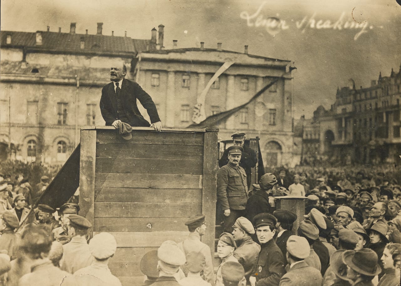
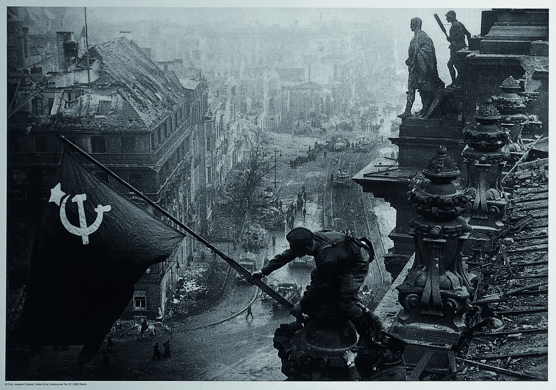
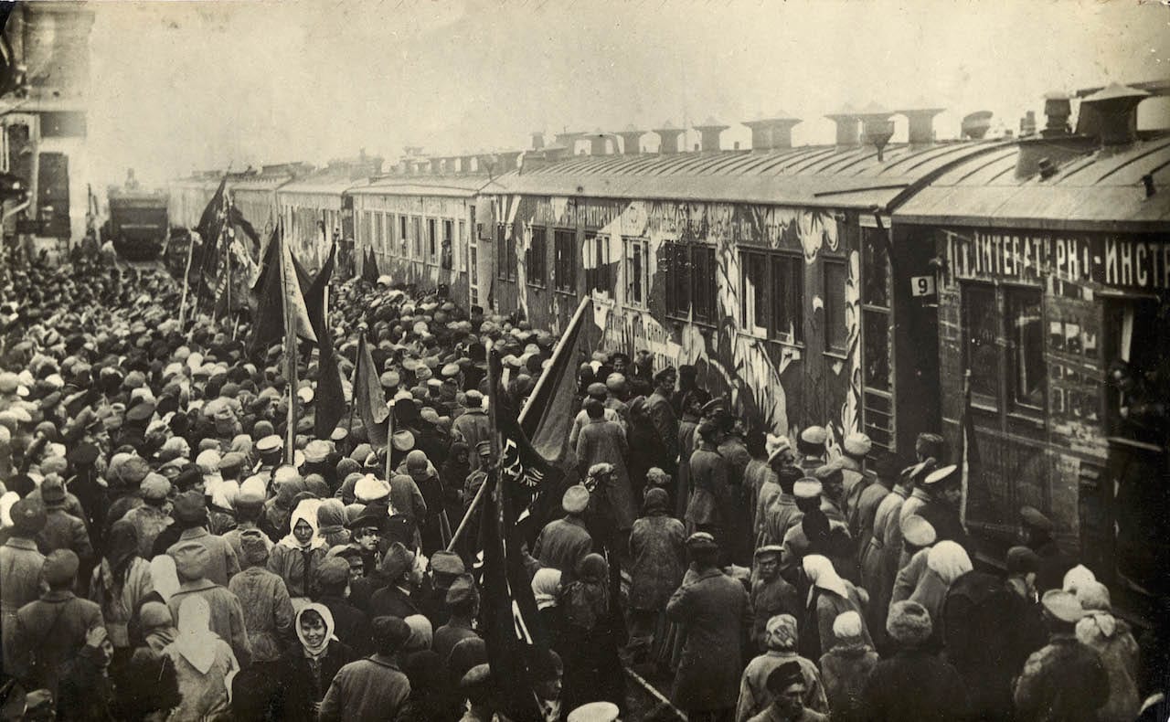
The David King Collection really started to expand from 1970 when King first visited Moscow and Leningrad and found to his great astonishment that Leon Trotsky, co-leader with Lenin of the Russian Revolution and founder of the Red Army, was nowhere to be found. “Stalin had not only had him assassinated but had completely wiped out all trace that he had ever existed, along with so many others. So on return to London I determined to track down every photograph that had ever existed of the great internationalist. That process still continues, the difference now being that the number of images of Trotsky in the collection are too many to count.
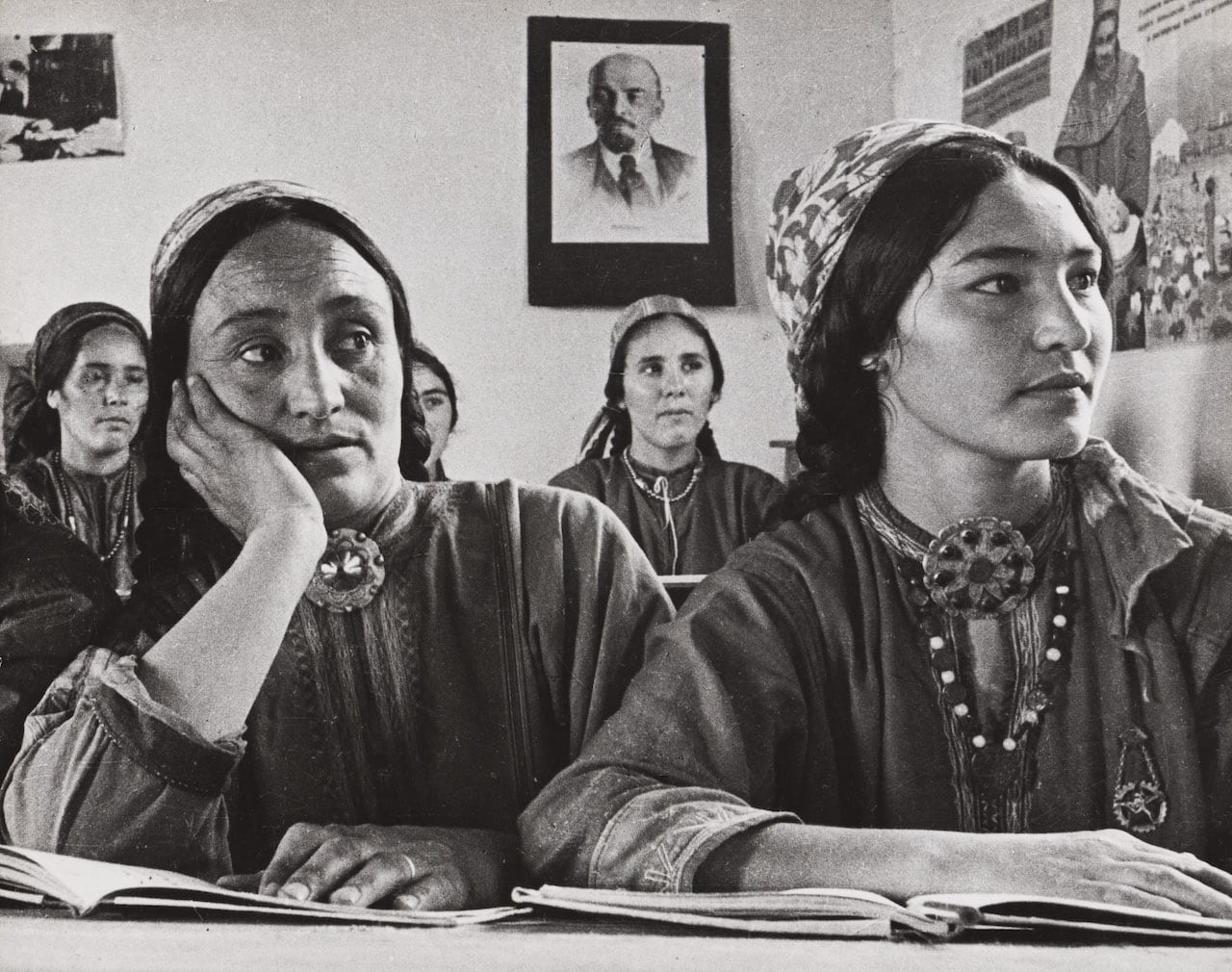
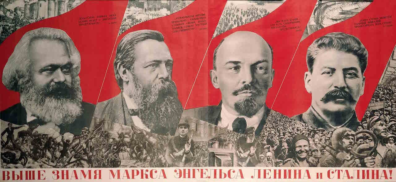
Since 2009, Tate Publishing has commissioned King to design, write and edit a series of large format books in full colour based on his collection. Red Star Over Russia – A Visual History of the Soviet Union from 1917 to the Death of Stalin appeared to great acclaim in 2009. This was followed by Russian Revolutionary Posters – From Civil War to Socialist Realism, From Bolshevism to the End of Stalinism (2012) and a new, enlarged edition of perhaps King’s most well-known work, The Commissar Vanishes – The Falsification of Photographs and Art in Stalin’s Russia (2014). Last year Tate published David King and Ernst Volland’s John Heartfield – Laughter is a Devastating Weapon, to coincide with a new room of the great anti-Nazi photomontagist’s work at Tate Modern.
Another of King’s books, entitled Ordinary Citizens – The Victims of Stalin, first published in 2003 and now much sought after since it is long out of print, deals with the “terrible truth” of official Soviet photography, via mugshots of Stalin’s everyday victims. Previously unseen in the West, these images show people accused of crimes they could not possibly have committed, photographed by the secret police at the Lubyanka, their infamous headquarters in Moscow, before being “trapped on Stalin’s conveyor belt of death”, as King puts it. The photographs were held in the Central Archives of the former KGB, and King researched through thousands of images.
“The photographs of the victims are small, passport size, pasted onto grey NKVD [forerunner of the KGB] paper, in covers stencilled and stamped with numerals, names and dates,” he says. “The sad, basic details of each person’s existence are written on lined paper in that well-educated script once so loved by Soviet bureaucrats. Everything is arranged in alphabetical order.”
Ironically, the photographs are extremely sensitive portraits, adds King, because of the way they were taken. “Unlike police mugshots in the West, they weren’t made using artificial light. The longer exposure time, using only natural light, allowed the subjects to face the camera and display a whole range of expressions. The faces are haunting, the expressions often heartbreaking. Most shocking are the few who smile back at the camera, or who attempt the hint of a smile.”
“The reappearance of these ordinary people, face-to-face with their accusers and close to death, serves as an indictment of Stalinism and the former Soviet Union,” he adds. “It also challenges those nations that still settle their judgements by imposing the ultimate penalty.”
Red Star Over Russia: A Revolution in Visual Culture 1905–55 is on show at Tate Modern until 18 February; entry costs £11.30, concession £10 www.tate.org.uk